(2014-02-03, 05:24 AM)tradingolives Wrote: Hi Isatrader,
I would love to learn how to read the chart that you just posted for " US Sector Breadth visual diagram showing the current state of the market"
could you please comment on what conclusions would you draw out of that chart?
Hi tradingolives, welcome to the site and thanks for your question.
The sector breadth charts that I make for the elite members is created by scanning the entire US market for all the stocks above their 150 day moving averages in each sector with a market cap of over 50million. I then do the same scan for stocks below their 150 day moving averages in each sector and create the percentages for each sector to put on the weekly charts. This covers over 4500 stocks in the NYSE and Nasdaq and so is much broader than the NYSE Percentage of Stocks above their 150 day Moving Averages chart ($NYA150R) that I post each week as it includes stocks from the Nasdaq as well, and so is around twice the sample size.
I show the data in three ways to help to interpret it. Firstly, I show the data table in order relative strength.

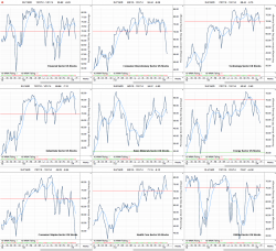
Secondly, I chart the percentages for each sector on a line chart, which you can see below.

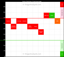
Finally, I create the visual diagram which shows all the sectors in a simple 100% scale block format, of which each block equals 10%. So as you can see from the data table above, 72.87% of stocks in the Utilities sector in the US market were above their 150 day moving averages this week. And so, the Utilities block is in the 70% row. Whereas, only 45.23% of stocks in the Consumer Staples sector in the US market were above their 150 day moving averages this week, and so the the Consumer Staples block is in the 40% row.
Each block is coloured according to the direction it moved that week so that you can see if the sector has moved up or down.
What the visual diagram gives you, is a snapshot of the market health, as stocks above their 150 day moving average are in Stage 2, and stocks below their 150 day moving average are in Stage 4. Whereas basing Stage 1 and topping 3 stocks fluctuate above and below their 150 day moving averages, but the majority of Stage 1 stocks will be above their 150 day moving averages and the majority of Stage 3 stocks will be below their 150 day moving averages. So a reading of 50% or greater means that more stocks in that sector are in Stage 1 & 2, i.e. bullish, and a reading of less than 50% means that more stocks in that sector are in Stage 3 & 4, i.e. bearish.
By looking at the visual diagram you can see at a glance if the market is bullish or bearish, and by comparing it to previous weeks you can see the changes occurring. For example, this week a number of sectors continued to move lower and moved down a row, and so the majority of sectors is now in the upper middle of the scale. Which is still in the bullish half of the range, but shows short term weakness. Only one sector is below the 50% level in the bearish half, which is Consumer Staples. So my interpretation is that it shows that the overall market is still on the bull side currently, but that it's weakened significantly over the last few weeks and is flirting with turning bearish, but it isn't there yet, and so could still recover again, so a more defensive strategy would be sensible currently, as the market has the ball and is trying to score against us, so we need to protect our gains. But that's just my opinion from my interpretation and others may see it differently.


