New Features: Relative Strength Section Added to the Stage Analysis Website
The Relative Strength (RS) section was added to the members area of the website this week, which currently has four pages: Sub-industries, Industries, Groups, Sectors. Each of which has a table initially ordered by the Mansfield RS score. But users can change the column sort order to view the percentage changes in each type by 1 week, 4 week, 13 week, 26 week or 52 week changes.
The table also has links in the Name column, which open a slide-out panel that shows a weekly chart of the selected item and lists the individual stocks associated with it in order of strength.
This is only the initial version of the RS pages, as it will continue to be developed in the coming months, with more new features to be added, and more ways that you can use the data in order to make Stan Weinstein's Forest to the Trees Approach easier to implement, alongside the existing powerful Market Breadth tools covering the Sub-industries, Industries, Groups, Sectors
So we hope you like the new features, and there's much more to come in 2025, as we continue to build the best Stage Analysis resource available.
US Sub-industry Groups Relative Strength Rankings
The purpose of the Relative Strength (RS) tables is to track the short, medium and long-term RS changes of the individual groups to find the new leadership earlier than the crowd.
Relative strength on the Stage Analysis website is measured by the Mansfield RS indicator, where a score above 0 is outperforming the market. So the highest score is the strongest, and lowest score is the weakest.
In the Stage Analysis method we are looking to focus on the strongest groups, as what is strong, tends to stay strong for a long time. But we also want to find the improving / up and coming groups that are starting to rise up strongly through the RS table from the lower zone, in order to find the future leading stocks before they break out from a Stage 1 base and move into a Stage 2 advancing phase.
Each week I go through the most interesting groups on the move in more detail during the Stage Analysis Members weekend video – as Industry Group analysis is a key part of Stan Weinstein's Stage Analysis method.
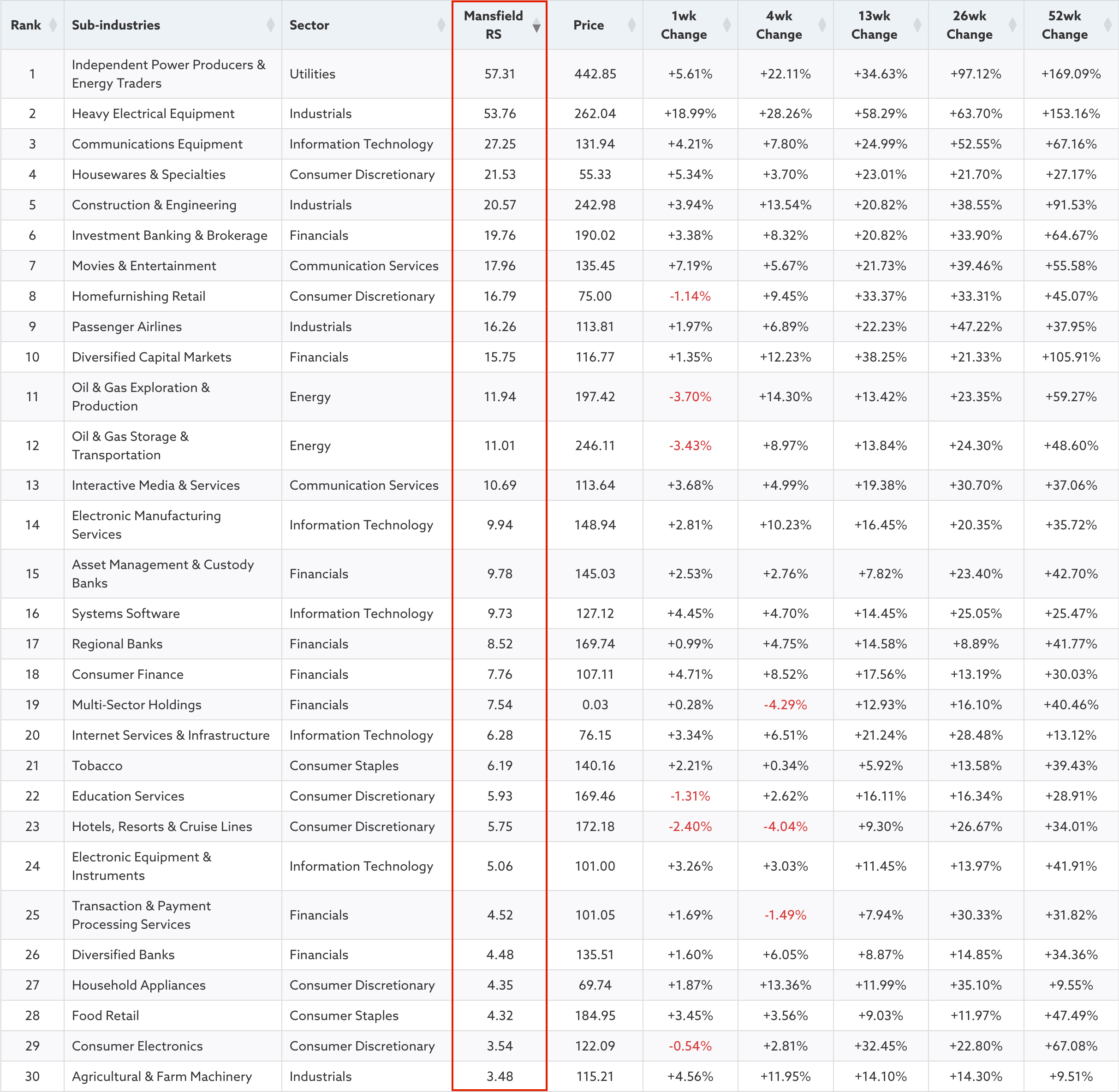
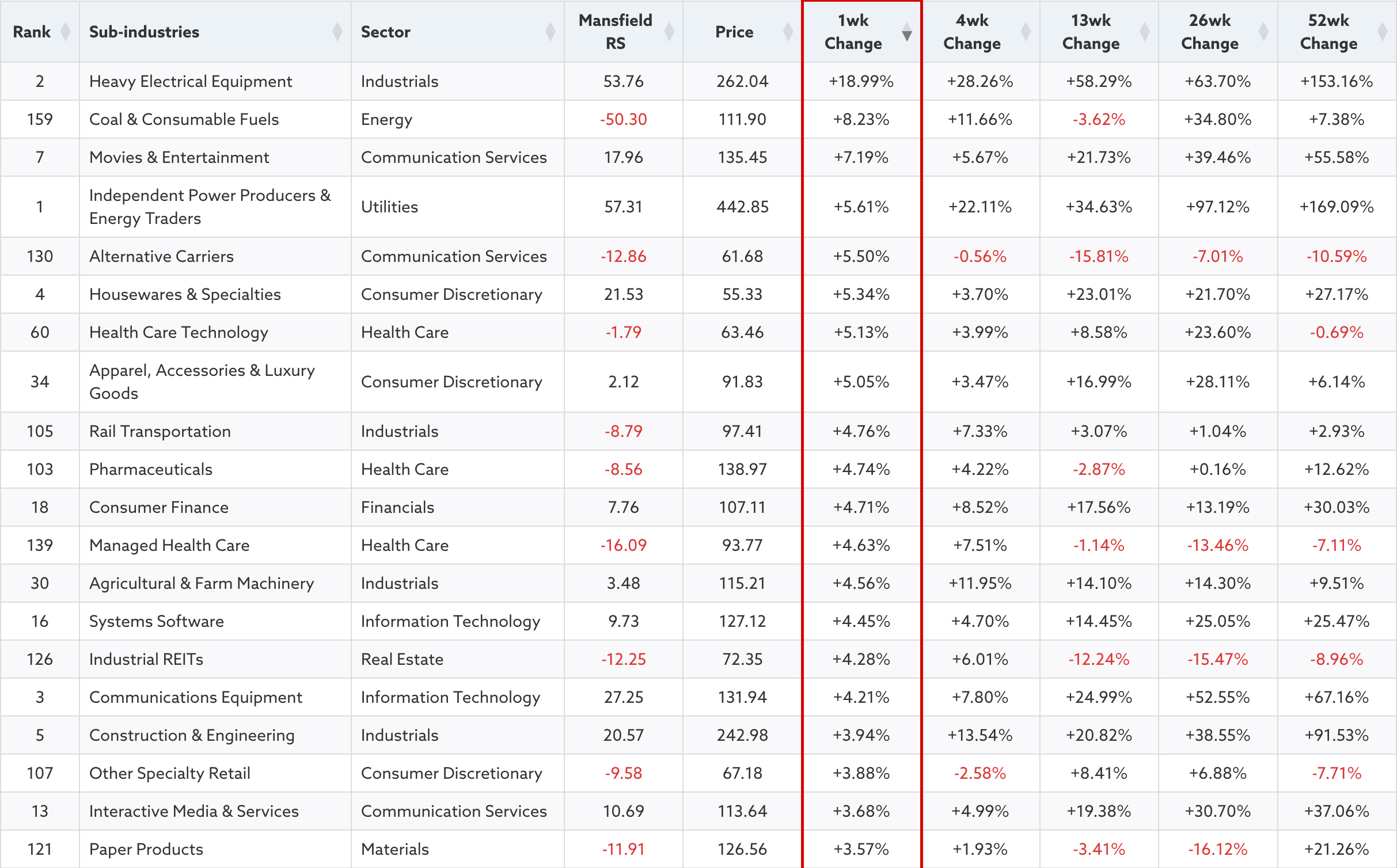
US Sub-industry Groups – Top 30 by RS Ranking
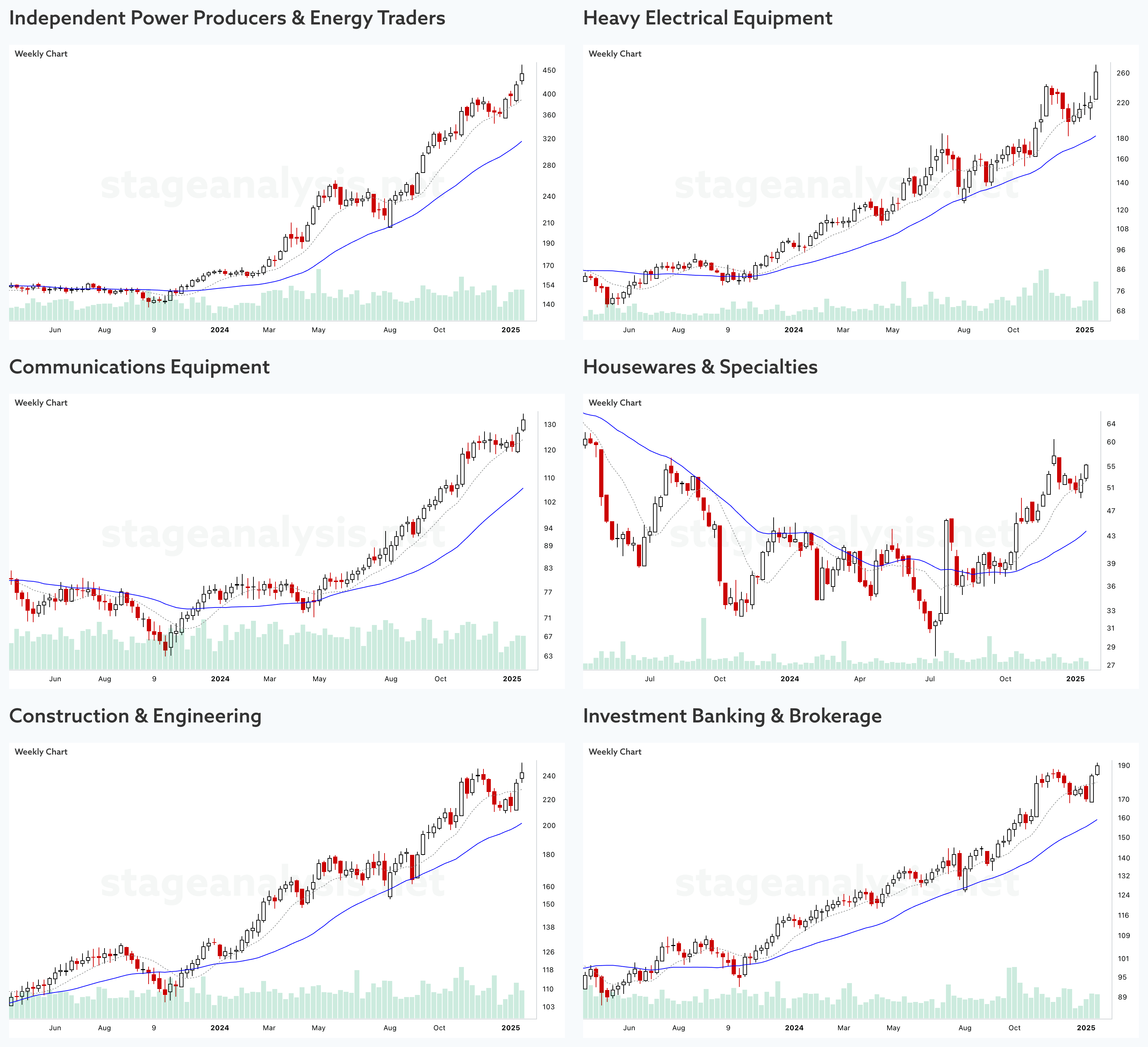
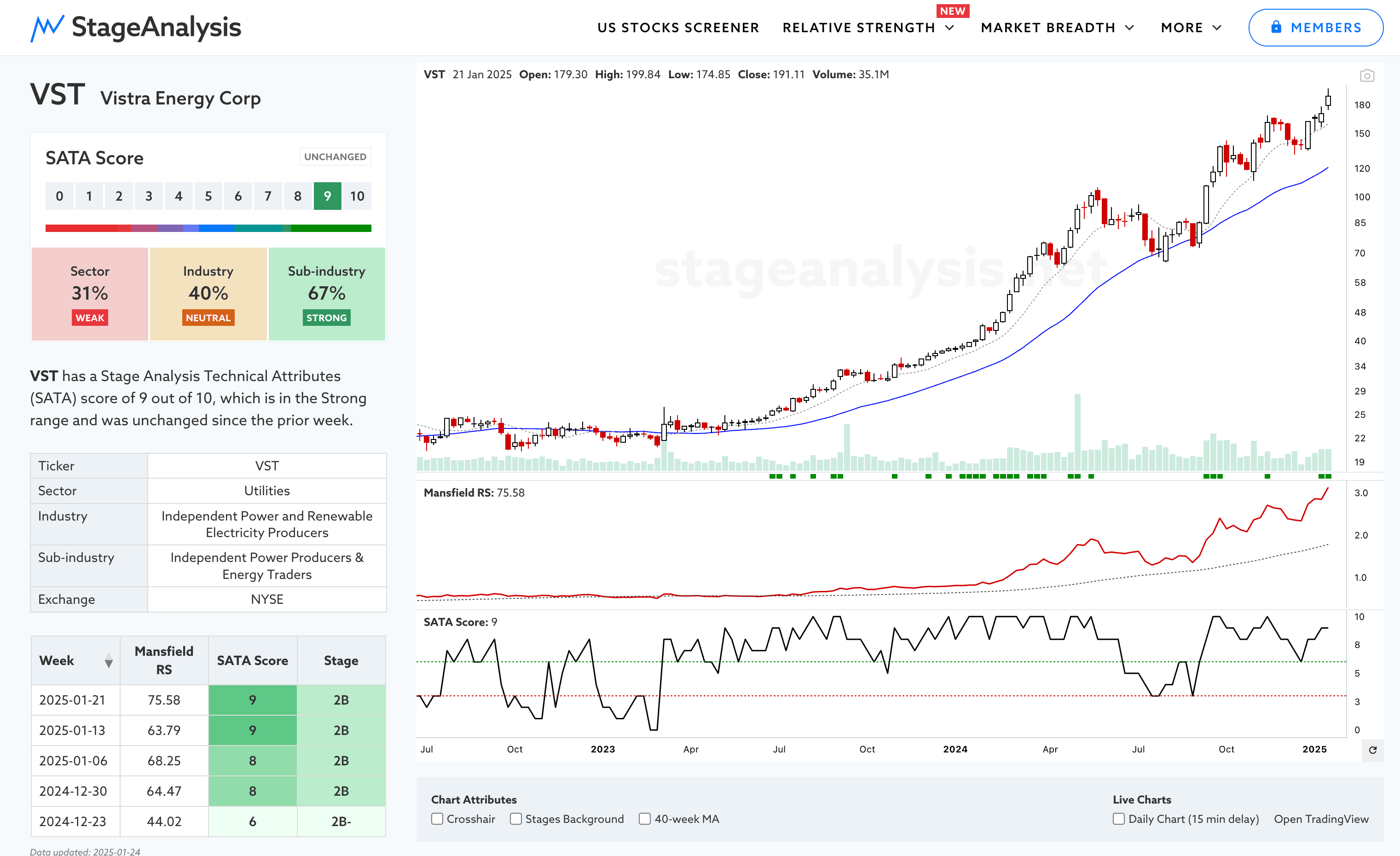
Independent Power Producers & Energy Traders is leading the RS rankings currently and has been the strongest sub-industry group of the last year with an impressive +169.09% 52 week gain. Some of the biggest Stage runs in the group include VST, GEV, NRG, TLN (weekly chart of VST below)
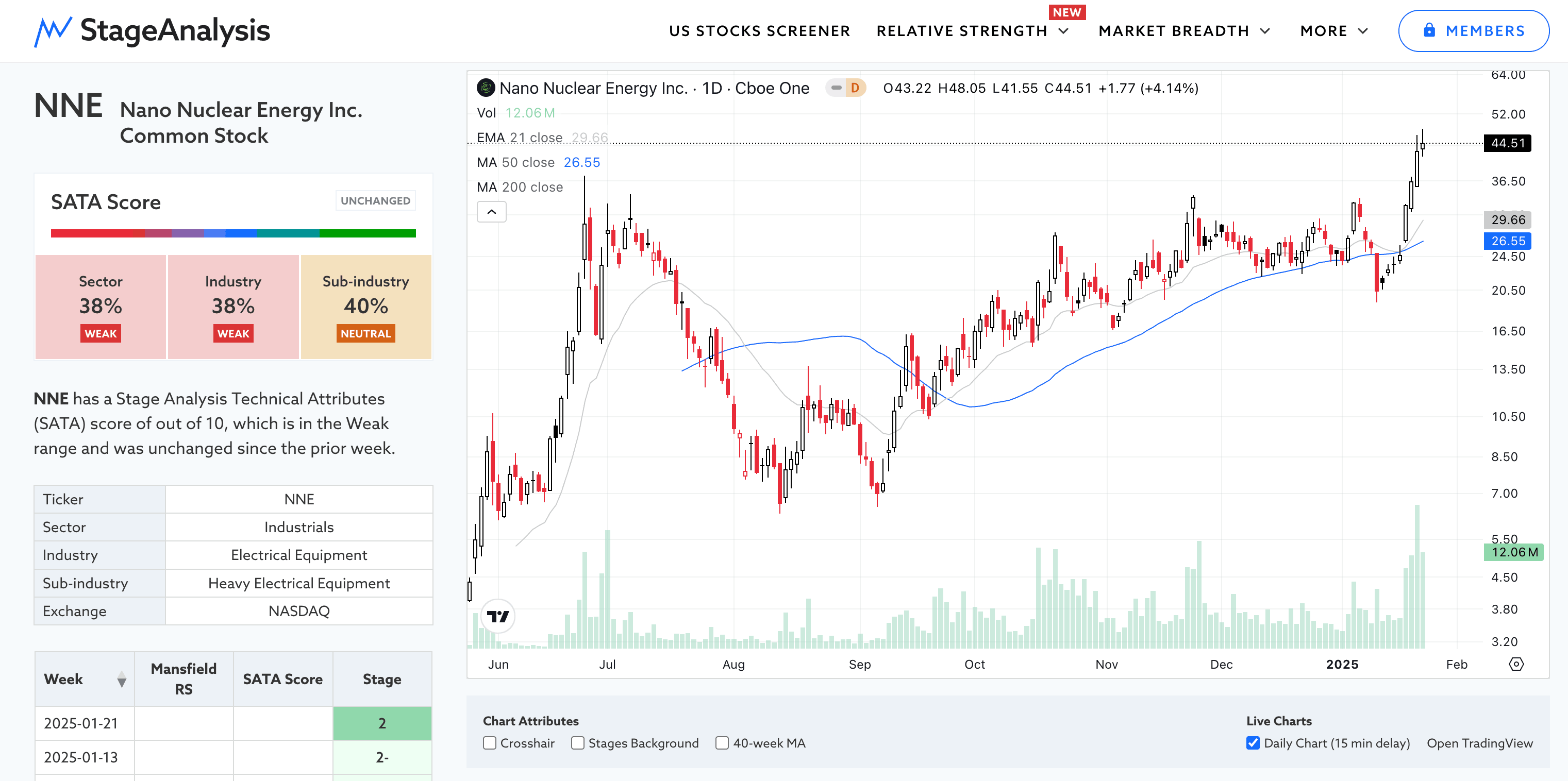
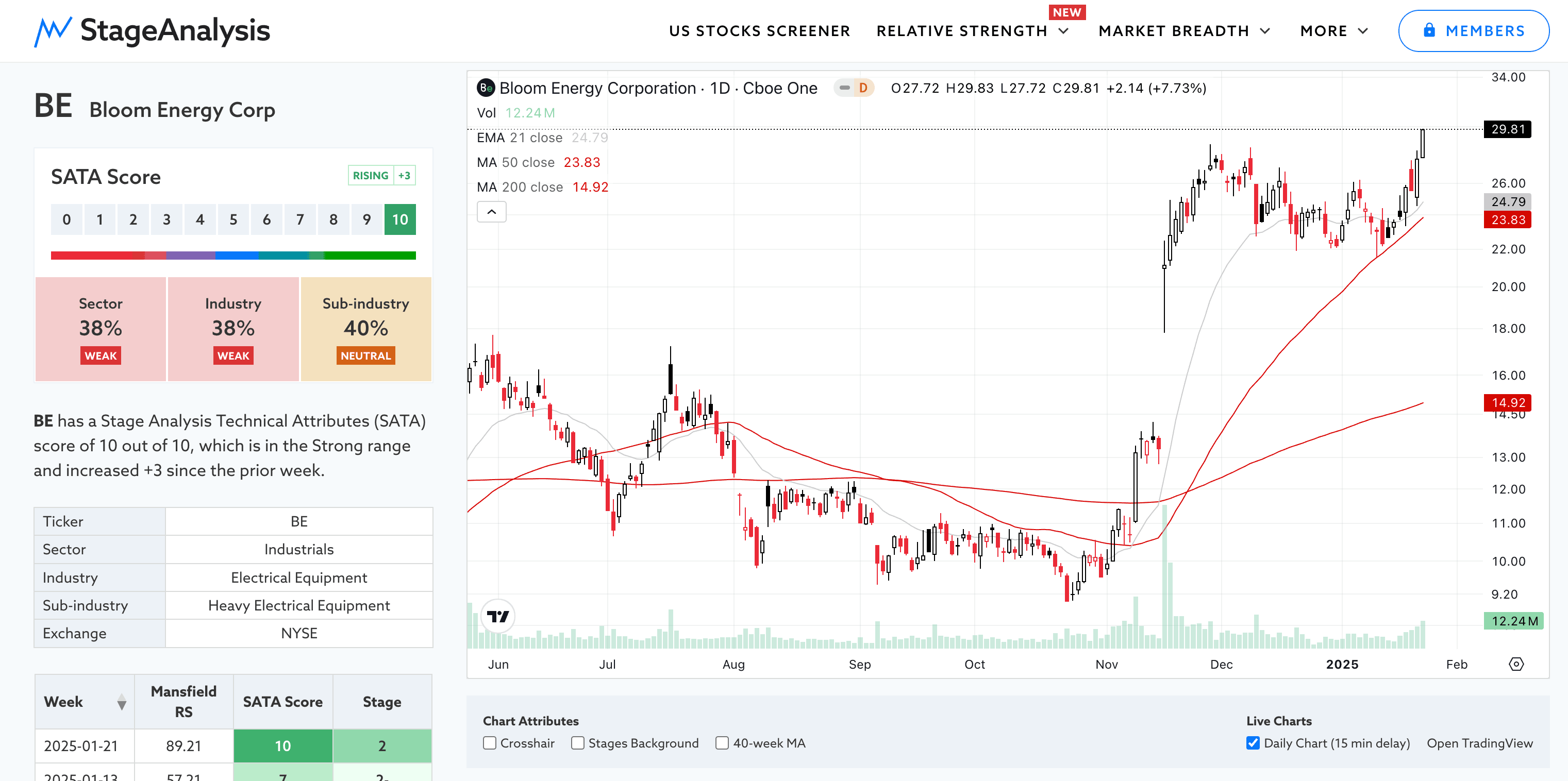
Heavy Electrical Equipment was this weeks strongest mover with a +18.99% gain – which was mostly due to an exceptional +80.13% Stage 2 continuation move in NNE NANO Nuclear Energy, a microreactor and nuclear technology company, but also from the strong +24.62% Stage 2 continuation move in BE Bloom Energy Corp, which engages in the manufacture and installation of a solid oxide fuel-cell based power generation platform.
Both of which were highlighted earlier in the week on Tuesdays watchlist stocks post before the breakouts. Below are the daily charts.
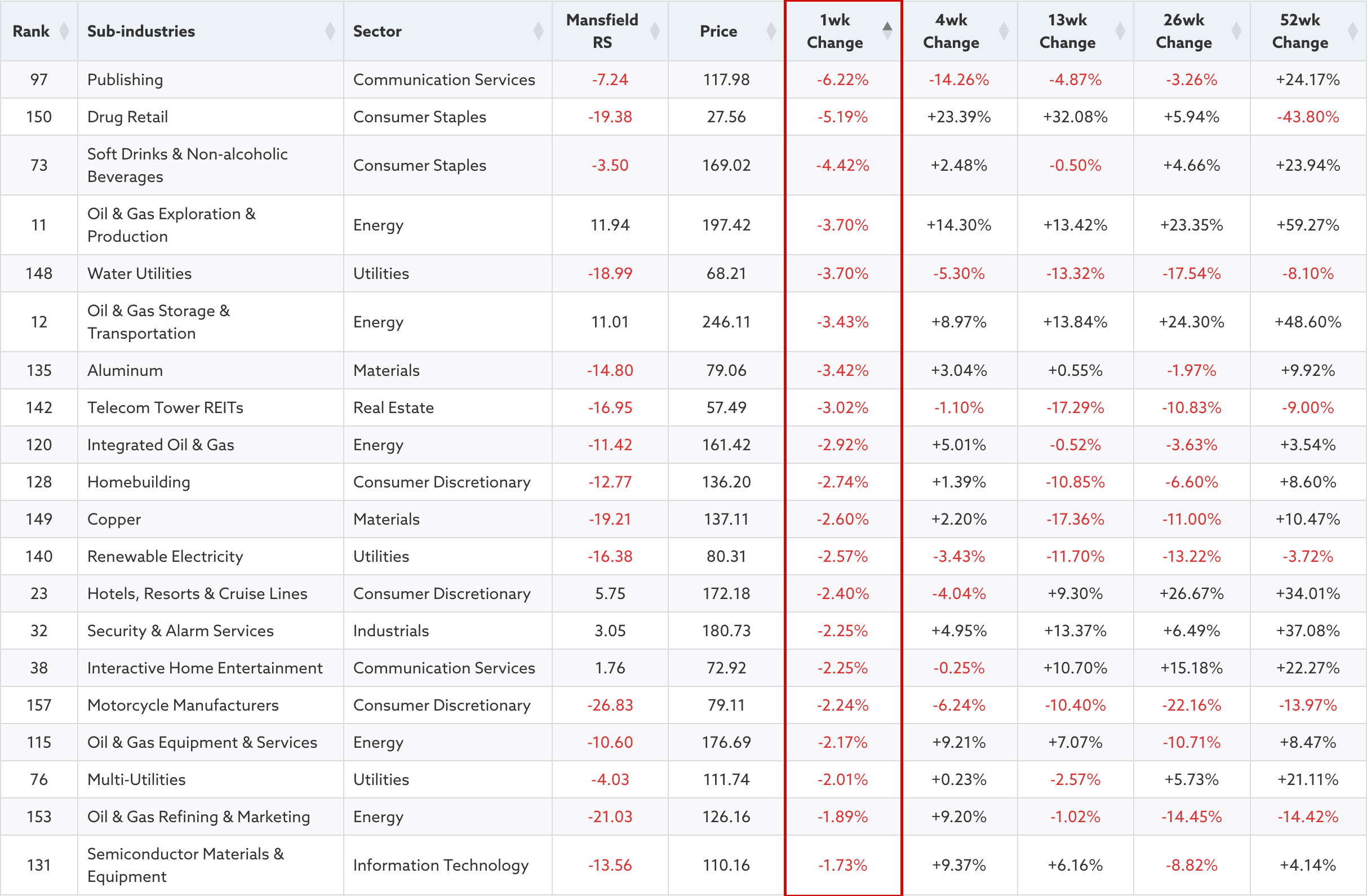
US Sub-industry Groups – Weakest 1 Week Percentage Change
There are now multiple ways on the Stage Analysis website to view individual groups and sectors via the GICS Sub-industries (163), Industries (74), Groups (25), Sector (11) pages in which you can easily filter via the Sectors and Sub-industries to see the component stocks and their current SATA and Mansfield RS data.
Plus you can view them via the US Stocks Screener – which now includes the Stages of each stock and other metrics not on the group pages. Plus the ability to scan for the 11 Sub-stages that we use on the website, as well as the Stage changes daily. So it's never been easier to find stocks that meet Stan Weinstein's Stage Analysis methods criteria.
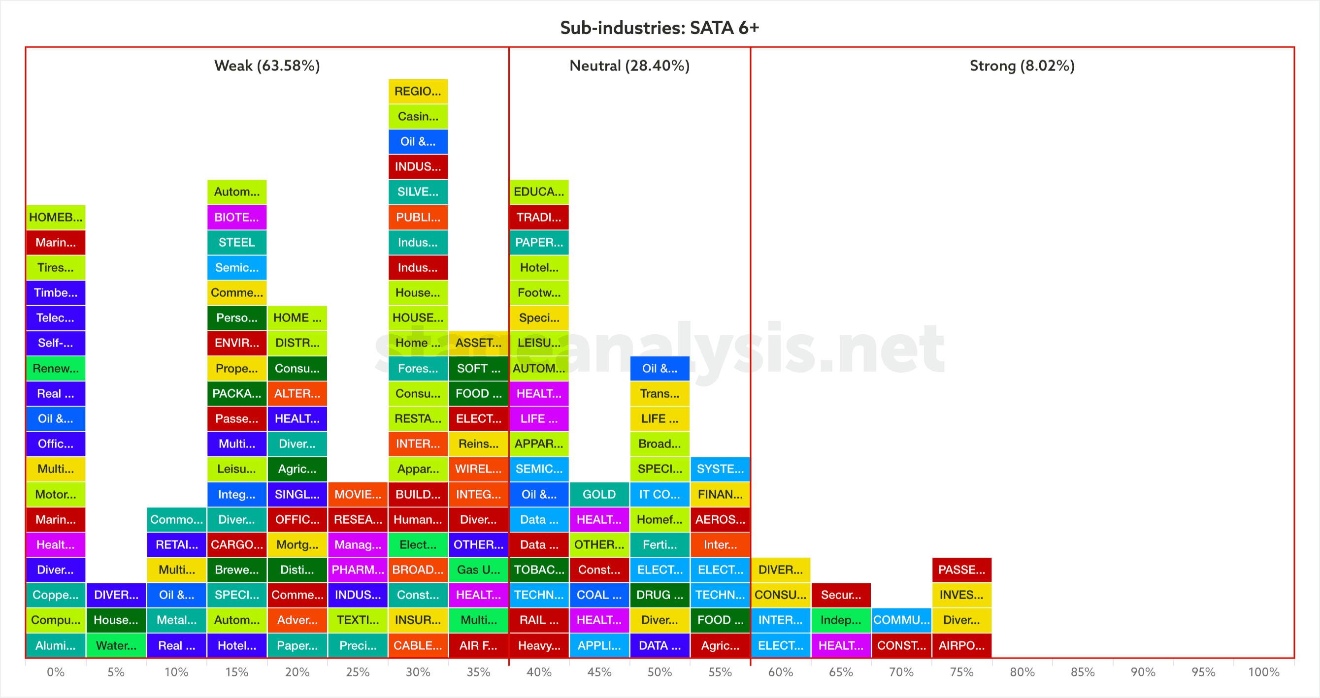
Sub-industries Breadth – Percentage of Technically Healthy Stocks
The interactive Bell Curve displays the sub-industries, industries and groups visually on a horizontal scale from 0 to 100%, and is divided into three zones. Weak (Below 40%), Neutral (40% to 60% range), Strong (Above 60%). It is updated daily with market data, so that users can instantly see where a group is relative to the rest of the market and by the position of all of the groups (and shape of the bell curve) get an idea of the overall market health as well.
The bell curve is interactive, and each group can be clicked on, which opens a new panel that allows the user to see the group chart, plus a table of the individual component stocks ordered by their Stage Analysis Technical Attributes (SATA) score and Mansfield RS data.
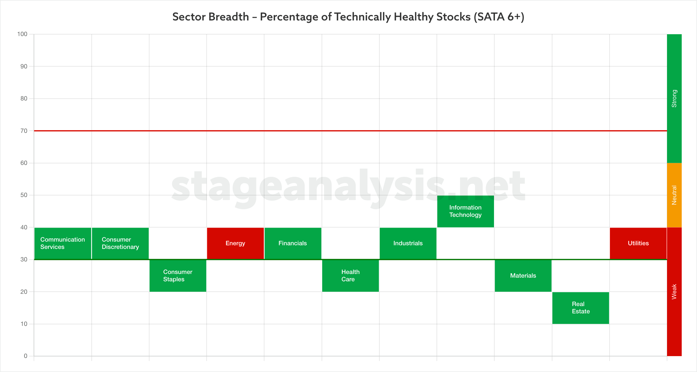
Sector Breadth – Percentage of Technically Healthy Stocks
The Sector Breadth page shows the same information as the Bell Curve graphics but is presented in different way, with a vertical chart that scales from 0 to 100%, and shows the position of each sector based on their technical health, via the percentage of stocks in each sector that have a Stage Analysis Technical Attributes (SATA) score of 6 or higher.
Become a Stage Analysis Member:
To see more like this – US Stocks watchlist posts, detailed videos each weekend, use our unique Stage Analysis tools, such as the US Stocks & ETFs Screener, Charts, Market Breadth, Group Relative Strength and more...
Join Today
Disclaimer: For educational purpose only. Not investment advice. Seek professional advice from a financial advisor before making any investing decisions.

