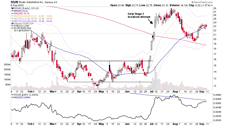
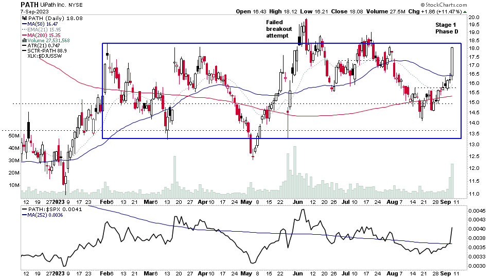
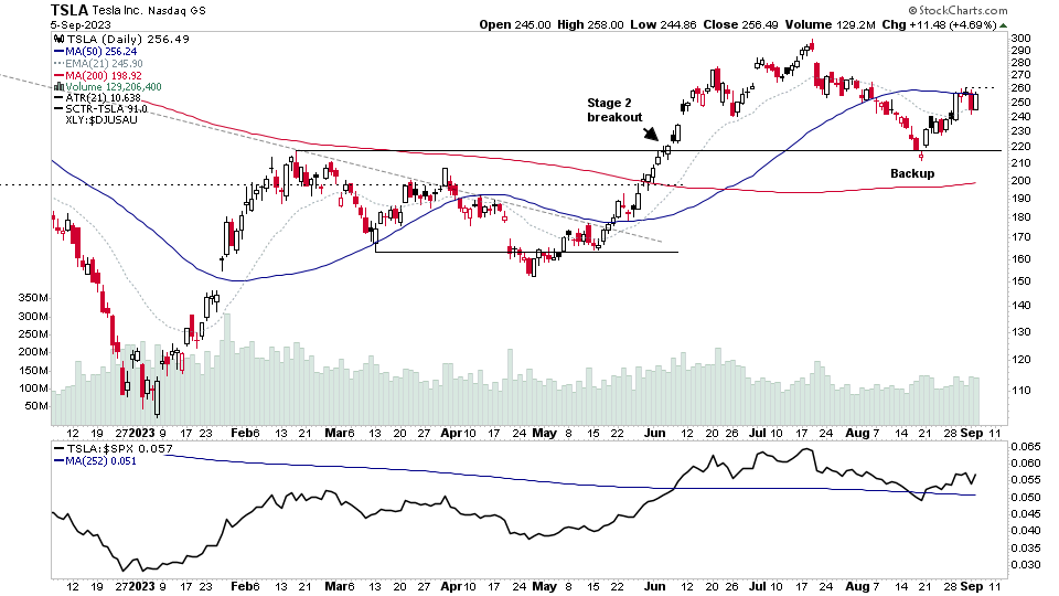
There were 16 stocks highlighted from the US stocks watchlist scans today...
Read More
Blog
10 September, 2023
US Stocks Watchlist – 10 September 2023
09 September, 2023
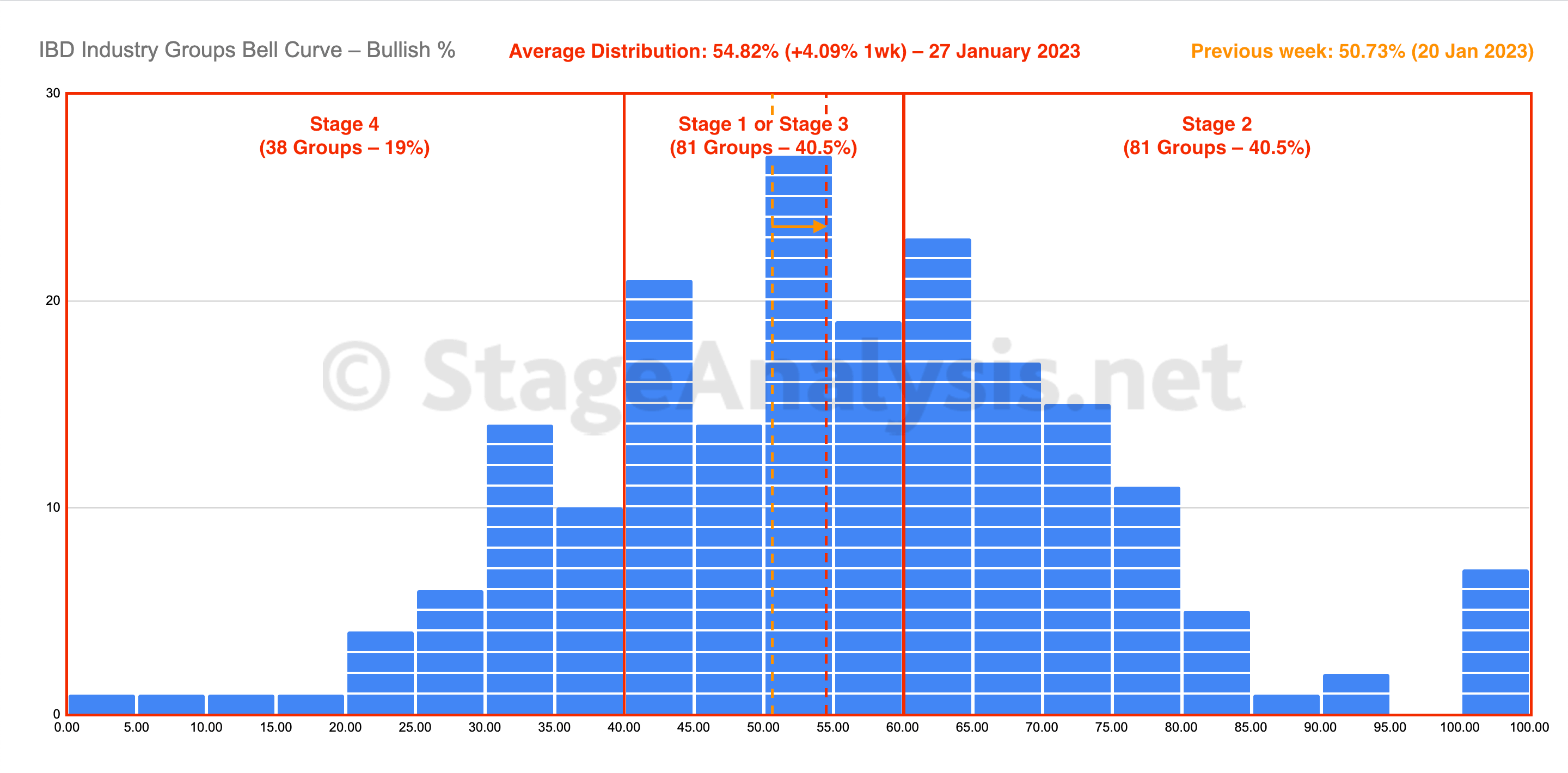
IBD Industry Groups Bell Curve – Bullish Percent
The IBD Industry Groups Bell Curve – Bullish Percent shows the few hundred industry groups plotted as a histogram chart and represents the percentage of stocks in each group that are on a point & figure (P&F) buy signal. This information provides a snapshot of the overall market health in a unique way, and is particularly useful for both market timing strategies and as a tool in aiding with the Stage Analysis methods "Forest to the Trees" approach, where we look for developing group themes...
Read More
09 September, 2023
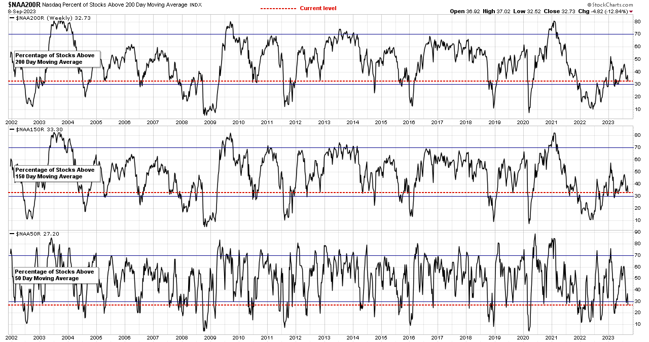
Market Breadth: Percentage of Stocks Above their 50 Day, 150 Day & 200 Day Moving Averages Combined
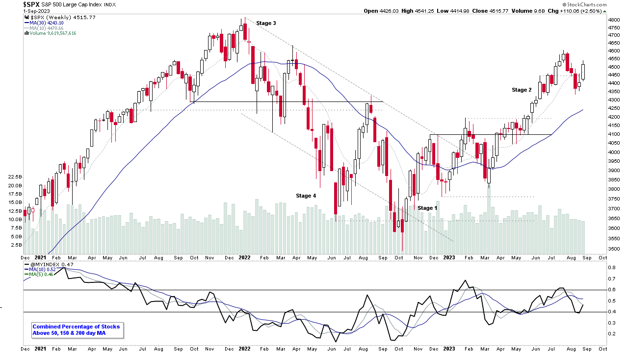
Custom Percentage of Stocks Above Their 50 Day, 150 Day & 200 Day Moving Averages Combined Market Breadth Charts for the Overall US Market, NYSE and Nasdaq for Market Timing and Strategy.
Read More
08 September, 2023
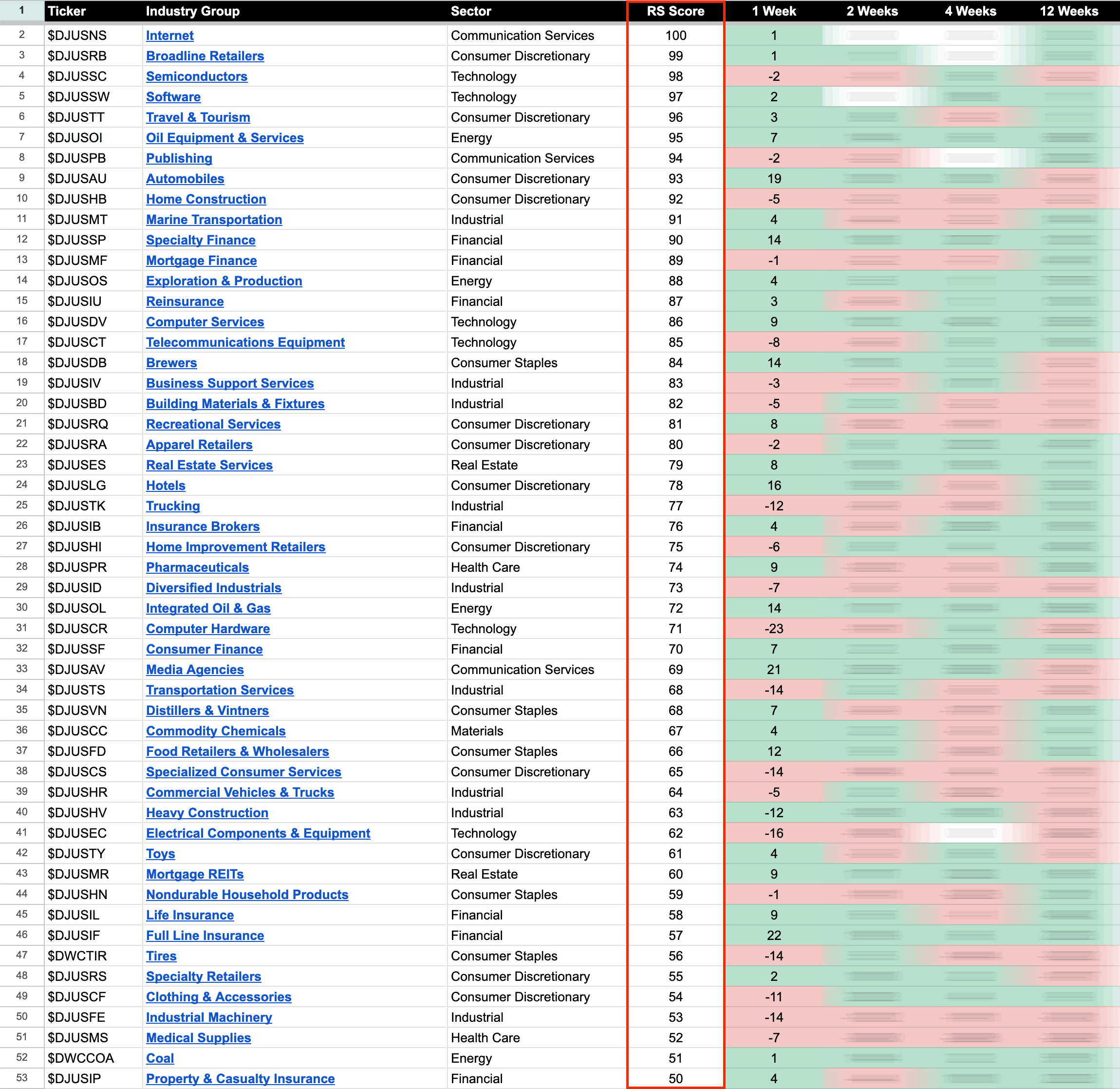
US Stocks Industry Groups Relative Strength Rankings
The purpose of the Relative Strength (RS) tables is to track the short, medium and long term RS changes of the individual groups to find the new leadership earlier than the crowd...
Read More
08 September, 2023
US Stocks Watchlist – 7 September 2023
There were 25 stocks highlighted from the US stocks watchlist scans today...
Read More
05 September, 2023
US Stocks Watchlist – 5 September 2023
There were 16 stocks highlighted from the US stocks watchlist scans today...
Read More
04 September, 2023
Stage Analysis Technical Attributes Scores – Nasdaq 100
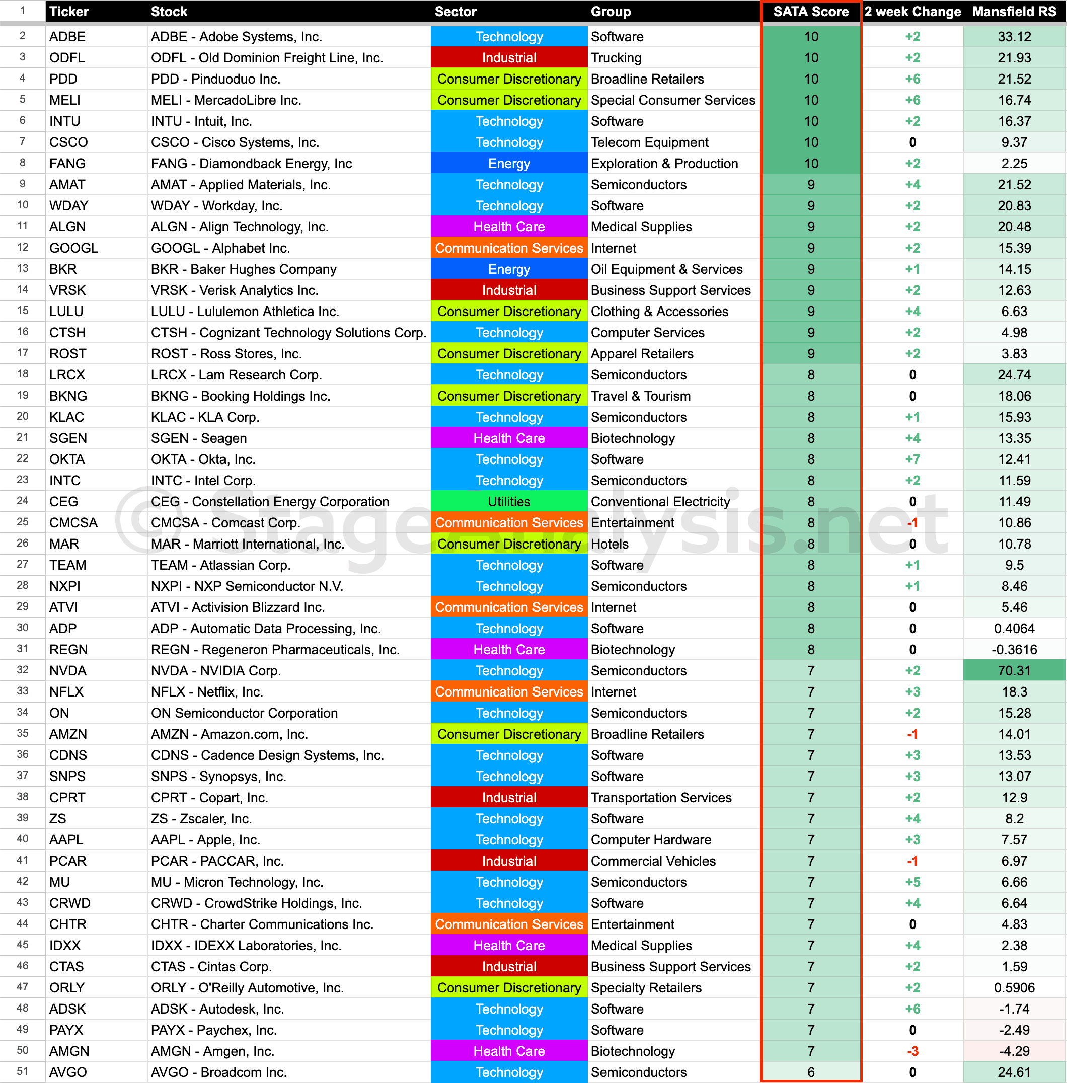
The Stage Analysis Technical Attributes (SATA) score is our proprietary indicator that helps to identify the four stages from Stan Weinstein's Stage Analysis method, using a scoring system from 0 to 10 that rates ten of the key technical characteristics that we look for when analysing the weekly charts.
Read More
03 September, 2023
Stage Analysis Members Video – 3 September 2023 (1hr 34mins)
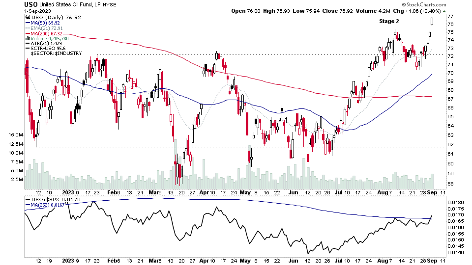
Stage Analysis members video discussing of the US market indexes, futures charts including the Crude Oil Stage 2 Breakout, industry groups, watchlist stocks and the essential market breadth measures that we use in the Stage Analysis method to determine the Weight of Evidence...
Read More
03 September, 2023
Crude Oil Futures Stage 2 Breakout Attempt and the US Stocks Watchlist – 3 September 2023
There were 28 stocks highlighted from the US stocks watchlist scans today...
Read More
02 September, 2023
IBD Industry Groups Bell Curve – Bullish Percent
The IBD Industry Groups Bell Curve – Bullish Percent shows the few hundred industry groups plotted as a histogram chart and represents the percentage of stocks in each group that are on a point & figure (P&F) buy signal. This information provides a snapshot of the overall market health in a unique way, and is particularly useful for both market timing strategies and as a tool in aiding with the Stage Analysis methods "Forest to the Trees" approach, where we look for developing group themes...
Read More

