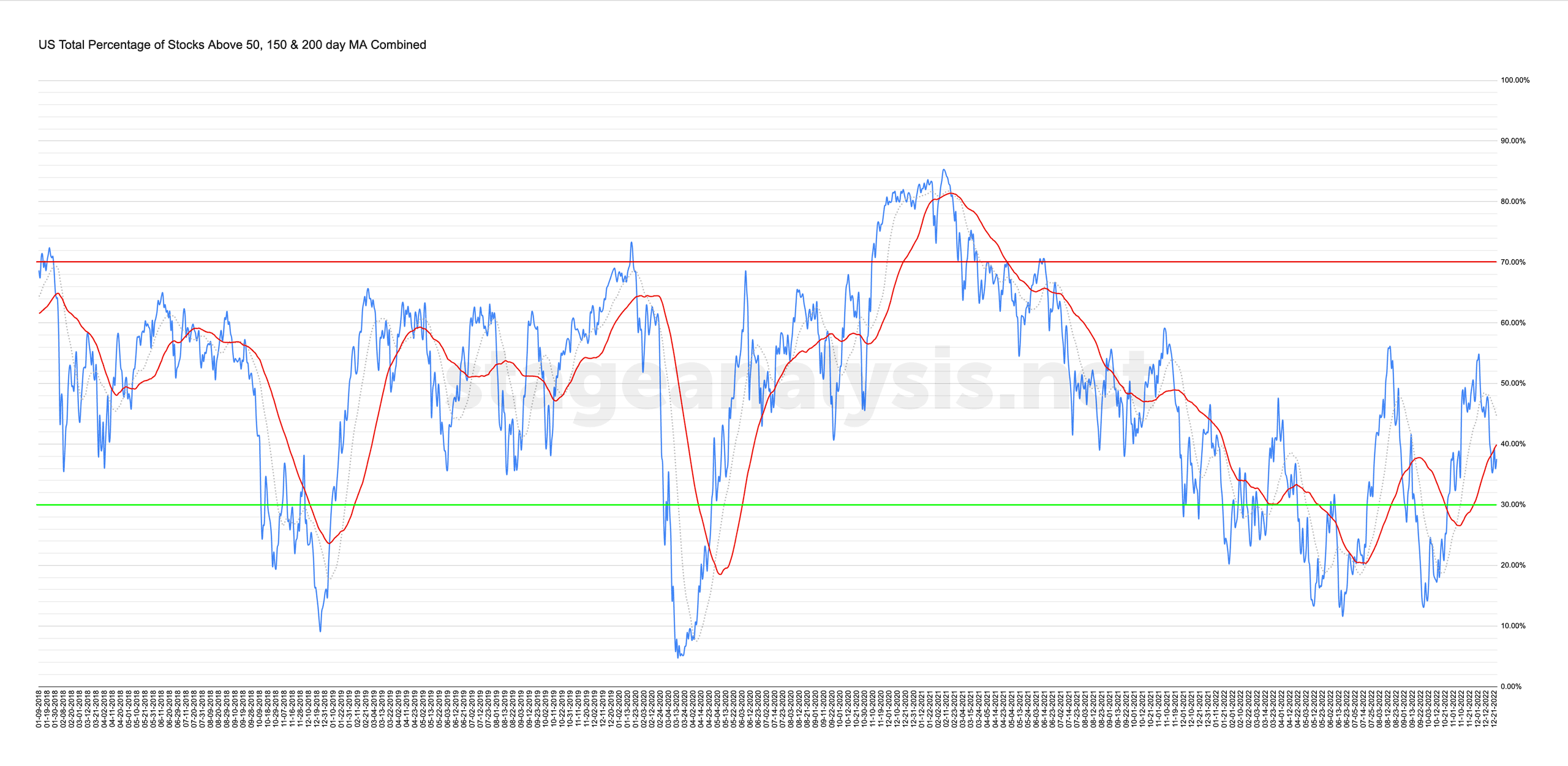
Custom Percentage of Stocks Above Their 50 Day, 150 Day & 200 Day Moving Averages Combined Market Breadth Charts for the Overall US Market, NYSE and Nasdaq for Market Timing and Strategy.
Read More

Blog
23 December, 2022
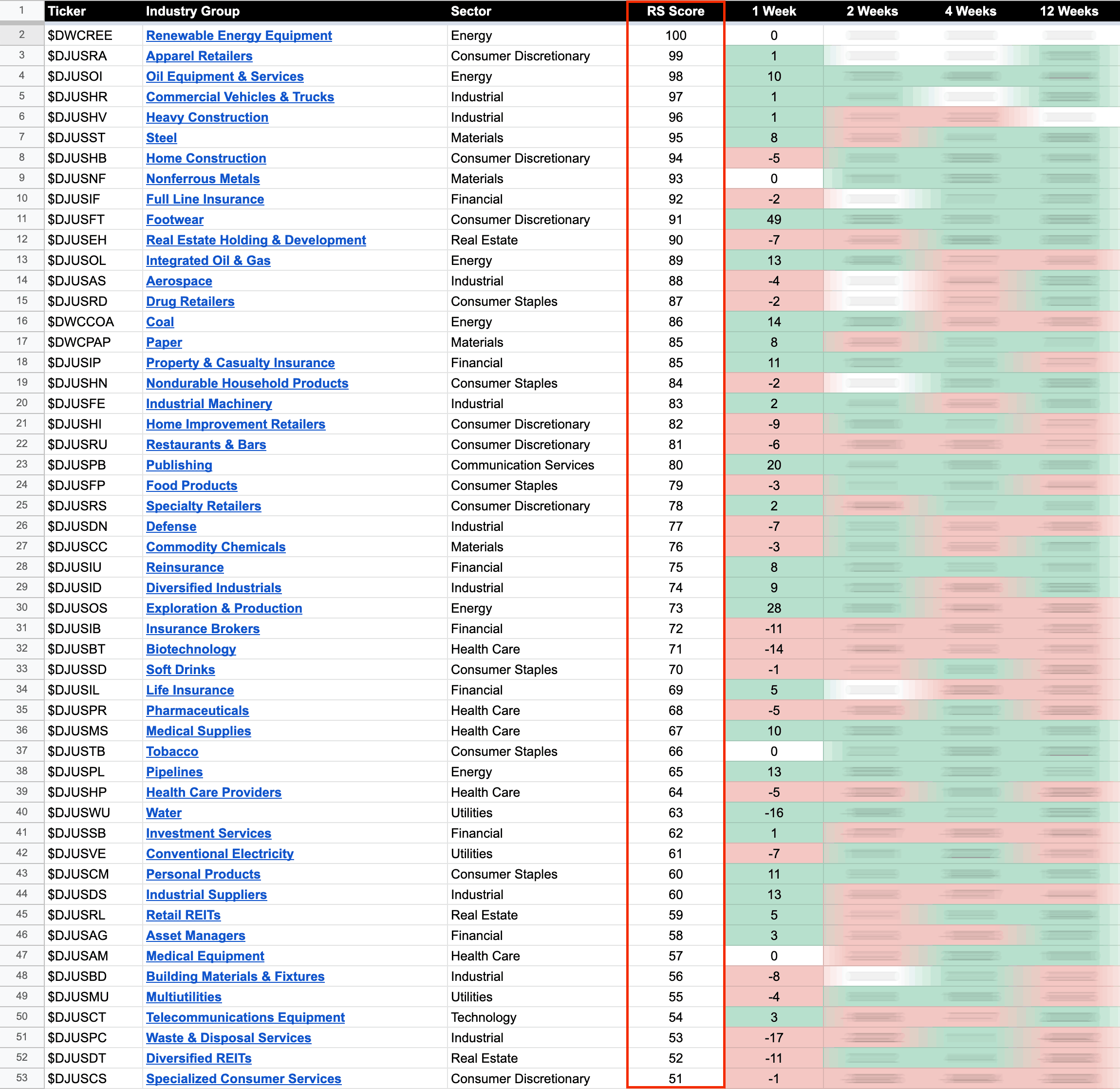
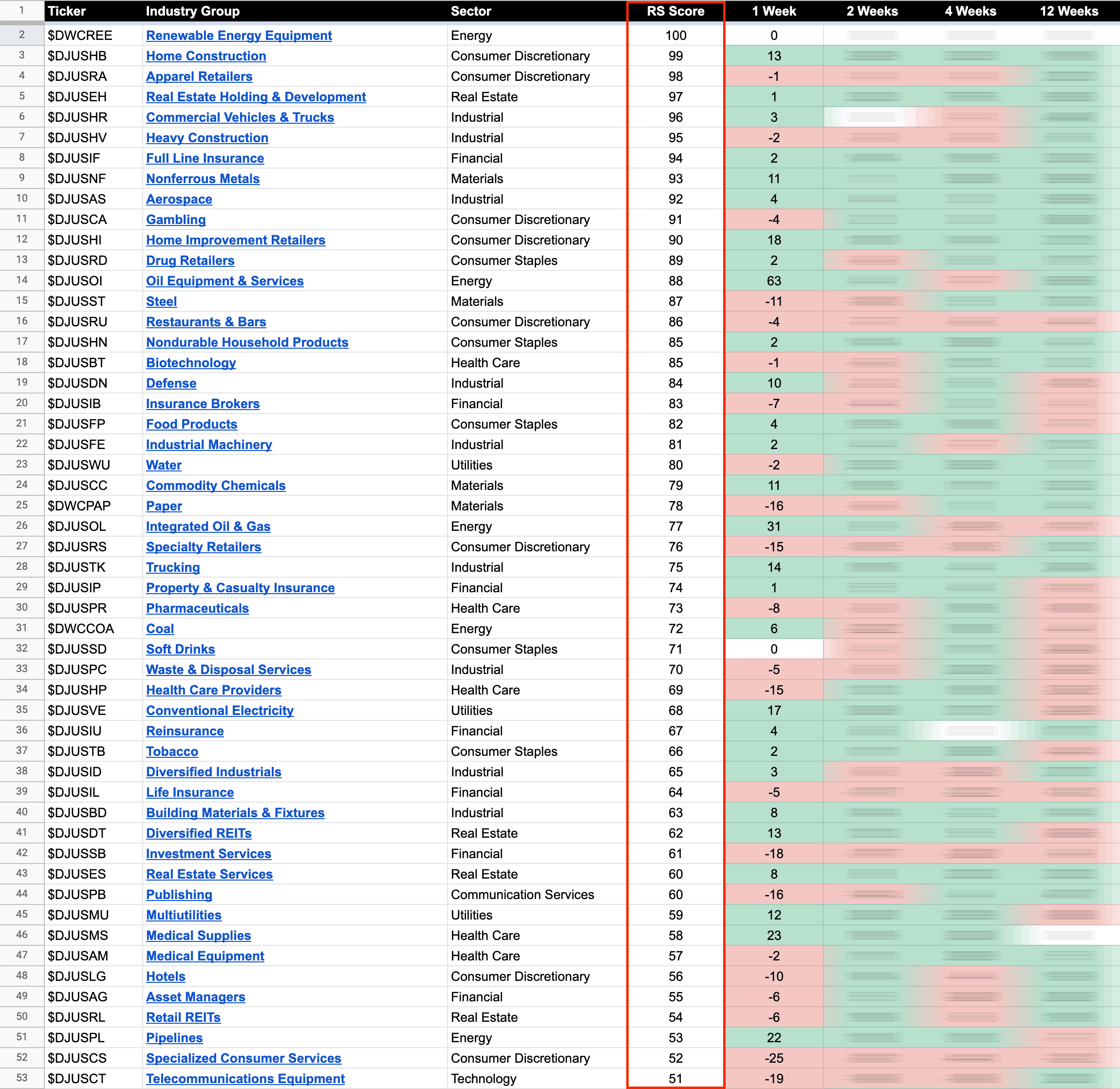
US Stocks Industry Groups Relative Strength Rankings
The purpose of the Relative Strength (RS) tables is to track the short, medium and long term RS changes of the individual groups to find the new leadership earlier than the crowd...
Read More
18 December, 2022
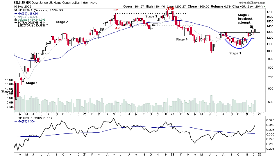
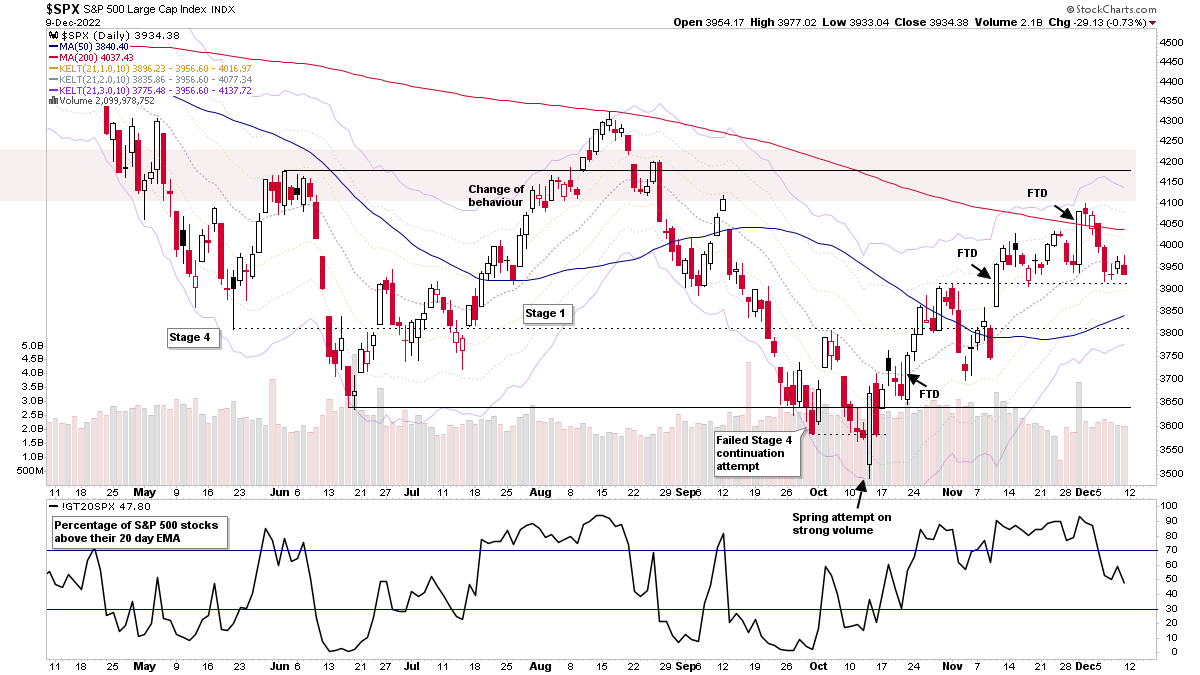
Stage Analysis Members Video – 18 December 2022 (1hr 23mins)
The Stage Analysis members weekend video begins this week with a special focus on the Home Construction Group stocks, of which multiple stocks within the group made a Stage 2 breakout attempt this week against the weak market action...
Read More
17 December, 2022
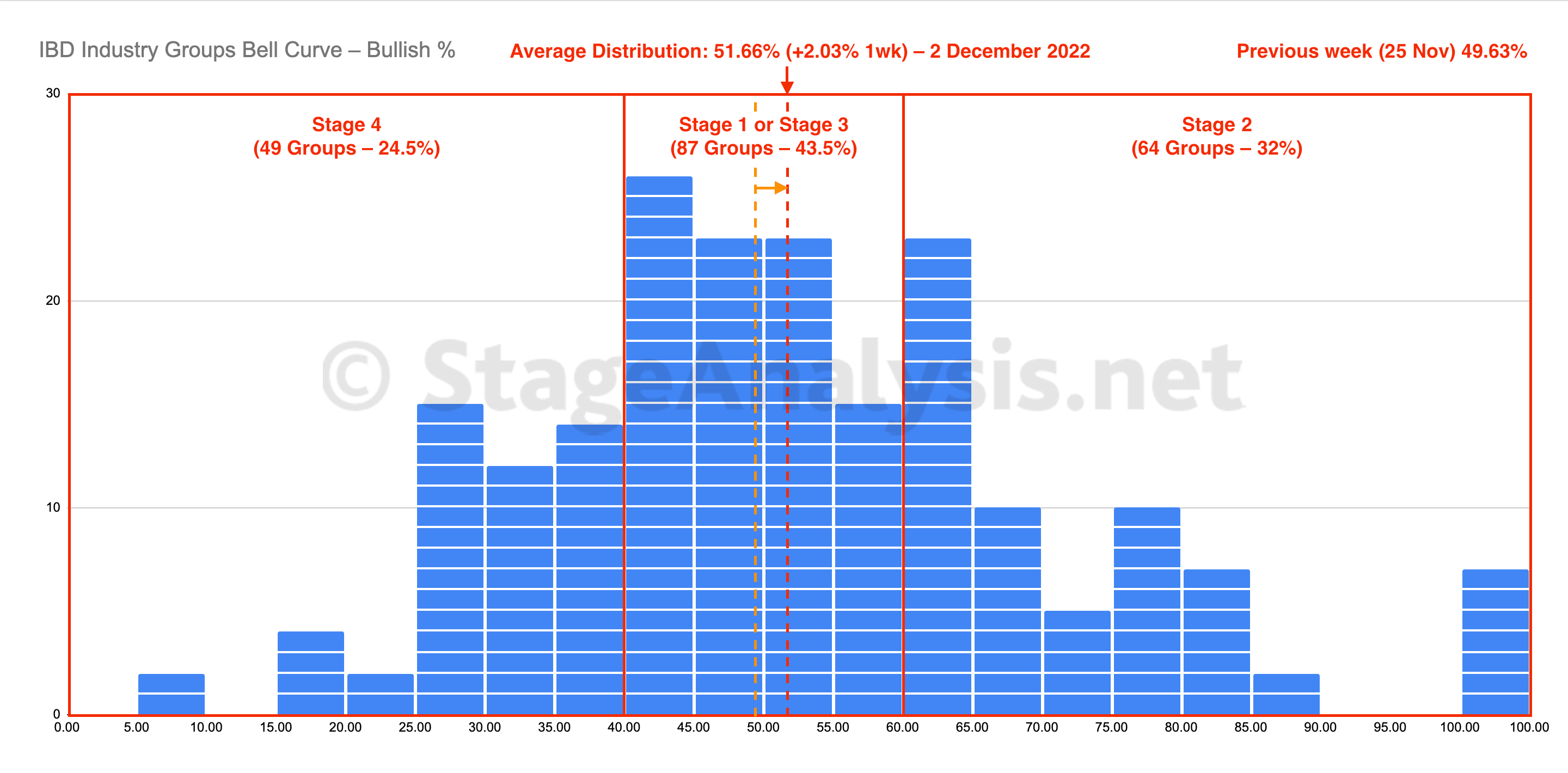
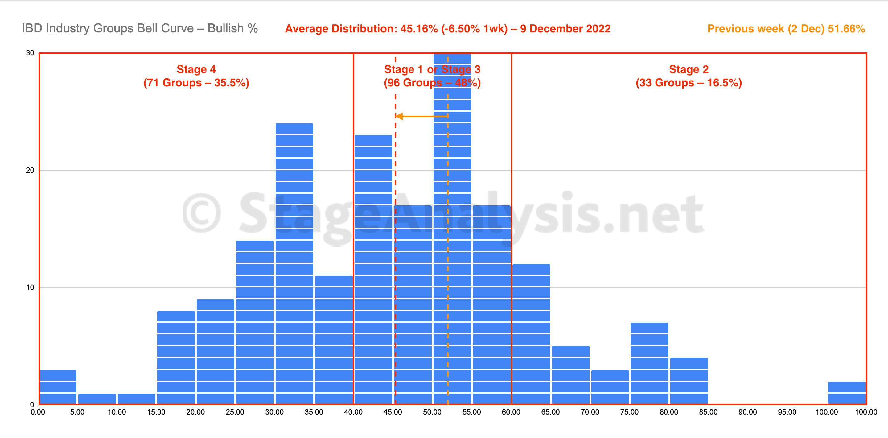
IBD Industry Groups Bell Curve – Bullish Percent
The IBD Industry Groups Bell Curve shows the distribution of the 200 IBD Narrow Industry Groups on a point and figure buy signal, plotted as a bell curve and includes the data tables of the 200 groups in relative strength order and the position changes over the last 1, 2 and 4 weeks.
Read More
16 December, 2022
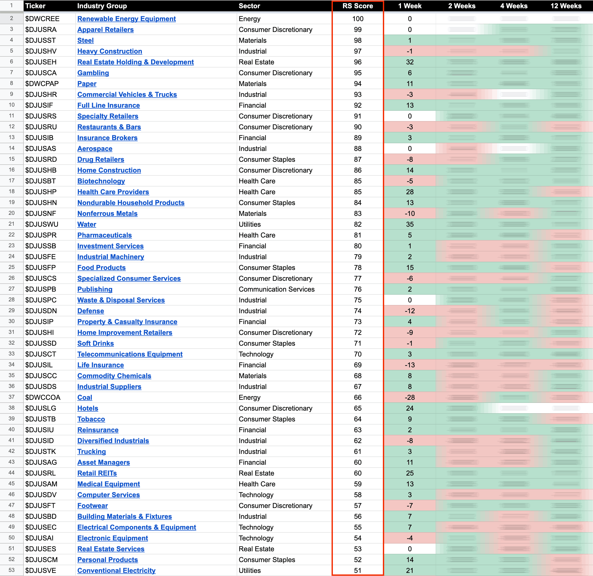
US Stocks Industry Groups Relative Strength Rankings
The purpose of the Relative Strength (RS) tables is to track the short, medium and long term RS changes of the individual groups to find the new leadership earlier than the crowd...
Read More
11 December, 2022
Stage Analysis Members Video – 11 December 2022 (1hr 5mins)
The Stage Analysis members weekend video discussing the market breadth charts to determine the weight of evidence, IBD industry group bell curve – percentage above 30 week MA and the bullish percent, industry groups relative strength, market indexes, and the US watchlist stocks in detail on multiple timeframes.
Read More
10 December, 2022
IBD Industry Groups Bell Curve – Bullish Percent
The IBD Industry Groups Bell Curve declined by -6.50% this week, dropping back into the lower half of the Stage 1 zone (between 40% and 60%). The amount of groups in Stage 4 increased by +22 (+11%), and the amount of groups in Stage 2 decreased by -31 (-15.5%), while the amount groups in Stage 1 or Stage 3 increased by +9 (+4.5%).
Read More
09 December, 2022
US Stocks Industry Groups Relative Strength Rankings
The purpose of the Relative Strength (RS) tables is to track the short, medium and long term RS changes of the individual groups to find the new leadership earlier than the crowd...
Read More
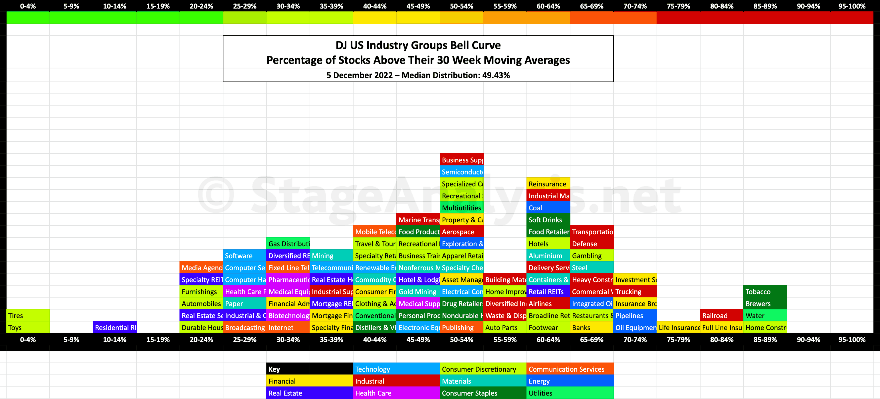
05 December, 2022
US Industry Groups Bell Curve – Exclusive to StageAnalysis.net
Exclusive graphic of the 104 Dow Jones Industry Groups showing the Percentage of Stocks Above 30 week MA in each group visualised as a Bell Curve chart...
Read More
04 December, 2022
Stage Analysis Members Video – 4 December 2022 (1hr 27mins)
The Stage Analysis members weekend video discussing the market indexes, Dollar index, commodities, industry groups relative strength, IBD industry group bell curve – bullish percent, market breadth charts to determine the weight of evidence, Stage 2 breakout attempts and the US watchlist stocks in detail on multiple timeframes.
Read More