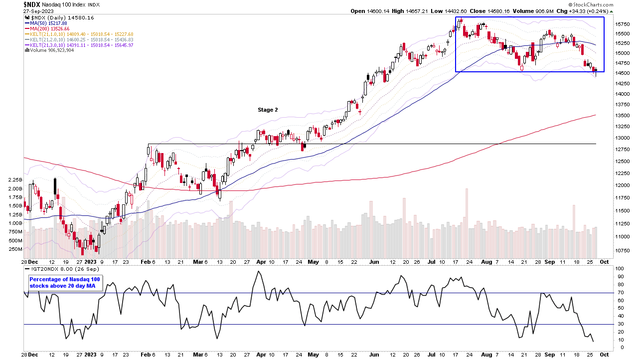
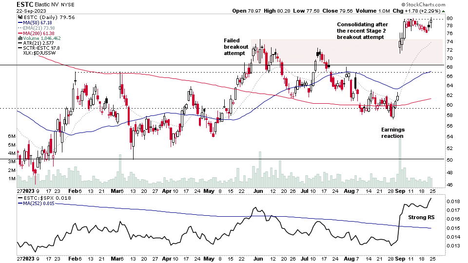
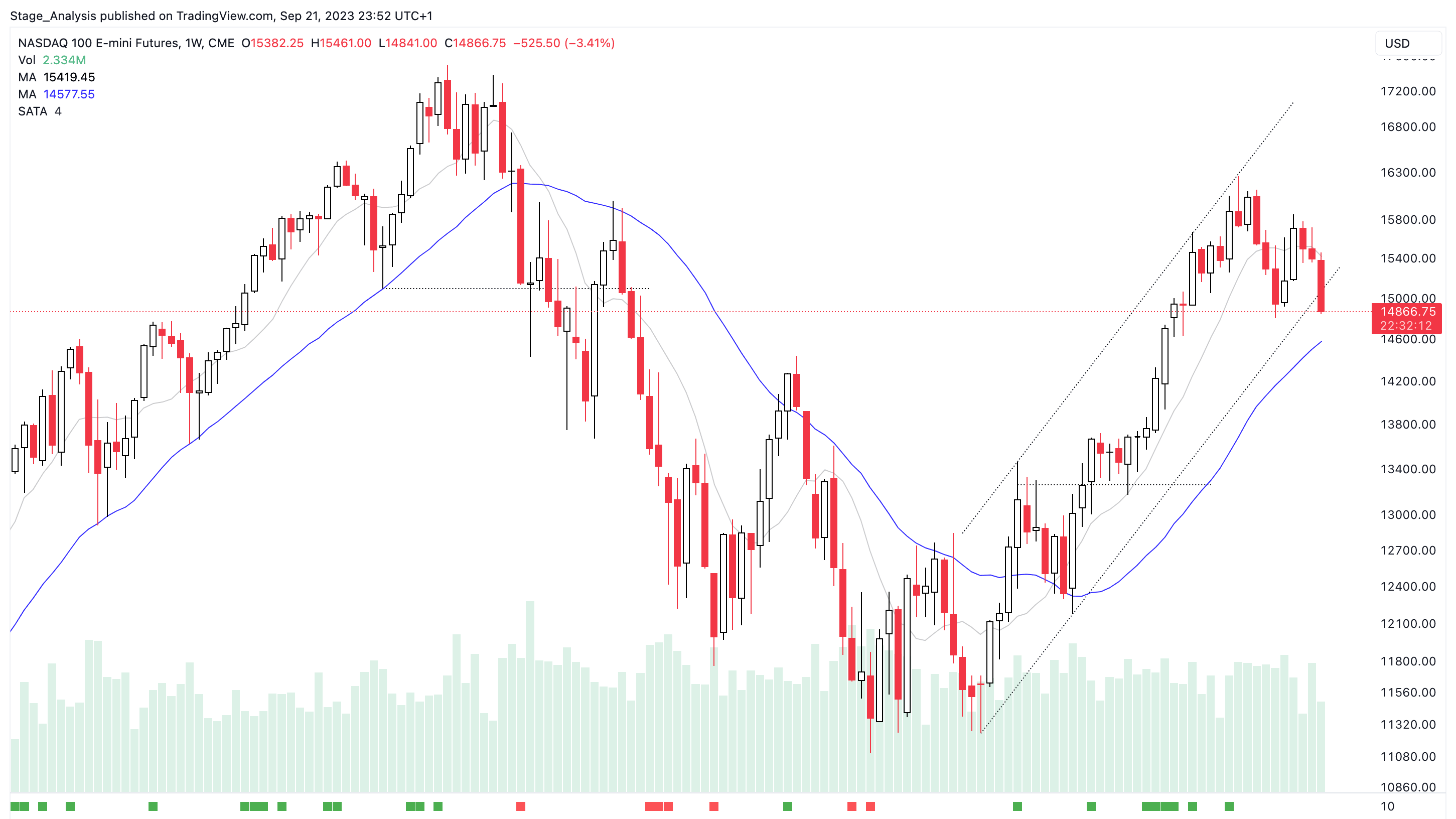
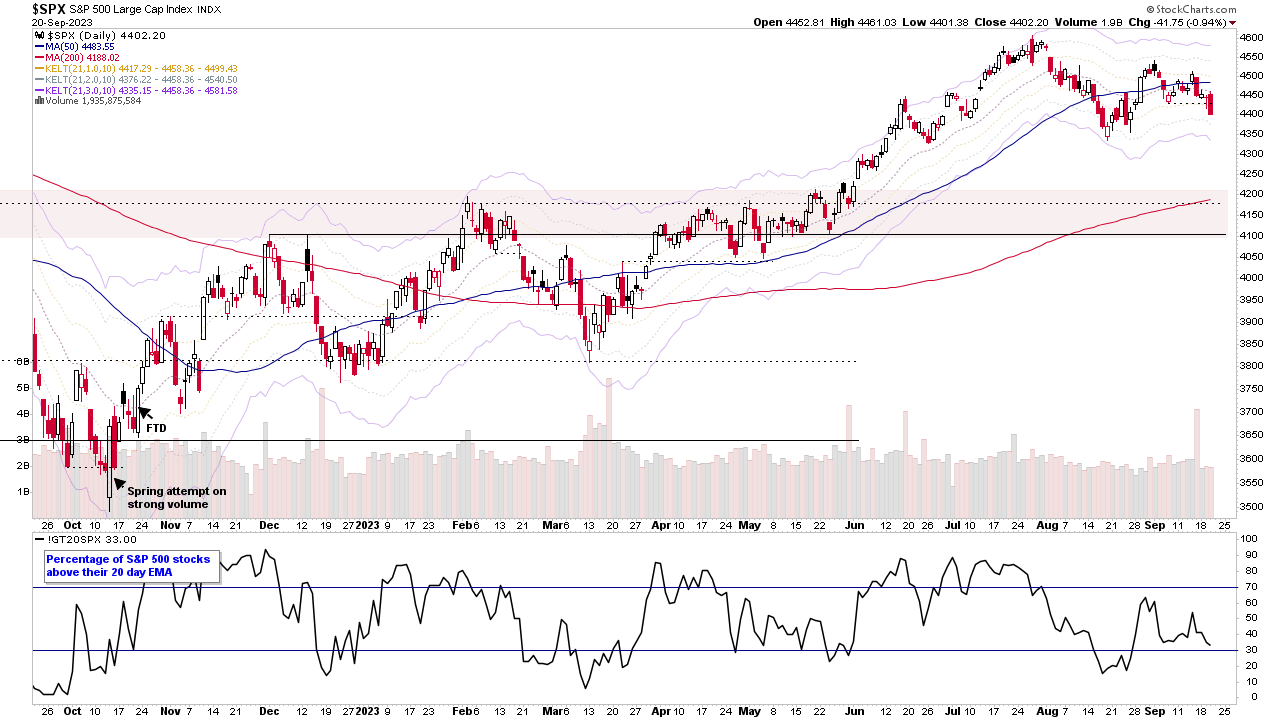
Stage Analysis midweek video discussing the price action in the market and short-term breadth measures. Also a look at the Stage positions of the S&P 500 leading stocks year to date as well as discussion of the recent watchlist stocks...
Read More
Blog
27 September, 2023
Stage Analysis Members Video – 27 September 2023 (57mins)
26 September, 2023
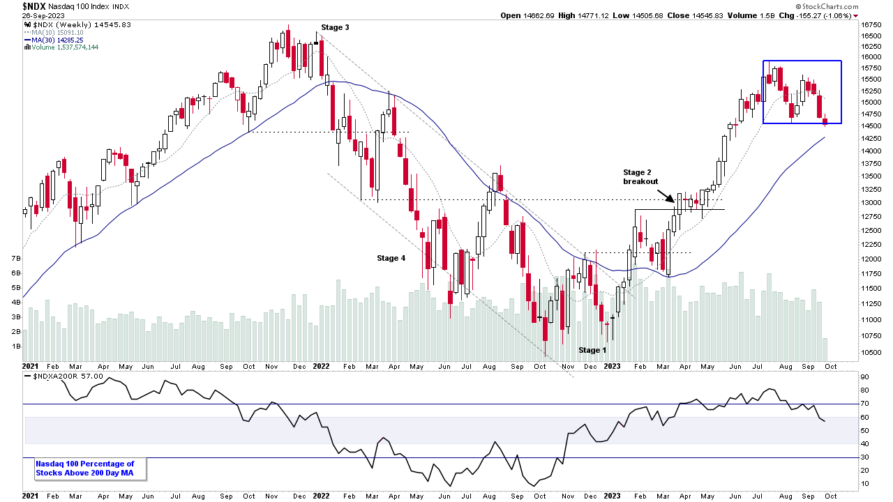
Nasdaq 100 Testing the Bottom of the Base and the US Stocks Watchlist – 26 September 2023
The Nasdaq 100 remains the year to date leader of the major indexes at +33.91%, and so it is a major focus currently during the correction...
Read More
25 September, 2023
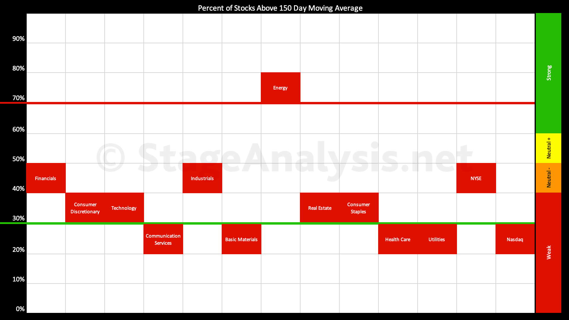
Sector Breadth: Percentage of US Stocks Above Their 150 day (30 Week) Moving Averages
The Percentage of US Stocks Above Their 150 day Moving Averages in the 11 major sectors has continued to deteriorate over the last month, and has fallen a further -6.86% since the previous post...
Read More
24 September, 2023
Stage Analysis Members Video – 24 September 2023 (1hr 21mins)
The regular weekend Stage Analysis members video featuring analysis of the major US indexes and futures charts, Industry Groups Relative Strength (RS) Rankings, the IBD Industry Group Bell Curve – Bullish Percent, the Market Breadth Update to help to determine the Weight of Evidence, and finally Stage Analysis of some of the recent stocks highlighted in the watchlist in detail, and on multiple timeframes...
Read More
24 September, 2023
US Stocks Watchlist – 24 September 2023
There were 17 stocks highlighted from the US stocks watchlist scans today...
Read More
23 September, 2023
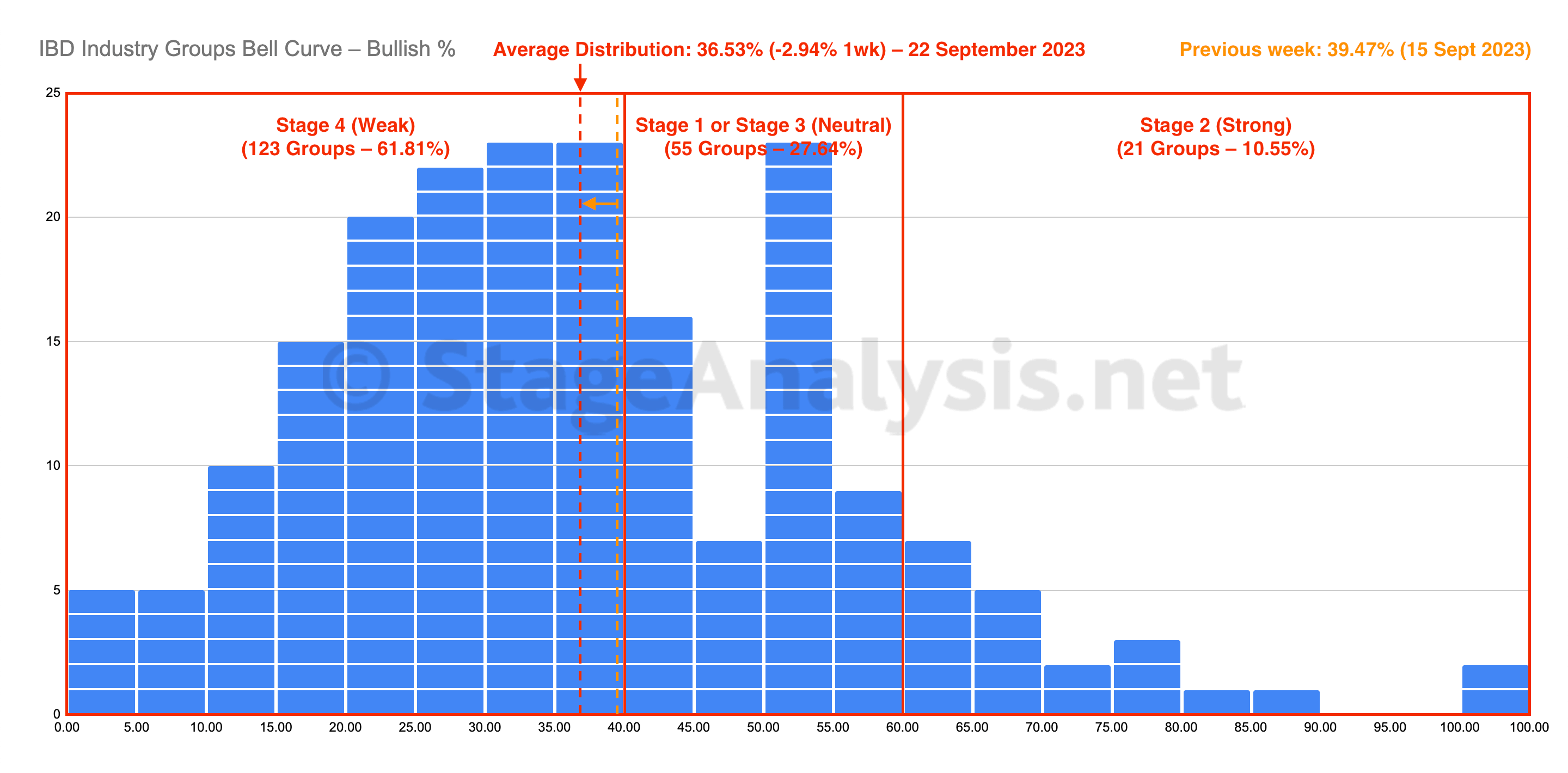
IBD Industry Groups Bell Curve – Bullish Percent
The IBD Industry Groups Bell Curve decreased by -2.94% this week to finish at 36.53% overall. The amount of groups in Stage 4 increased by 15 (+7.5%), and the amount of groups in Stage 2 decreased by 11 (-5.5%), while the amount groups in Stage 1 or Stage 3 decreased by 4 (-2%)...
Read More
23 September, 2023
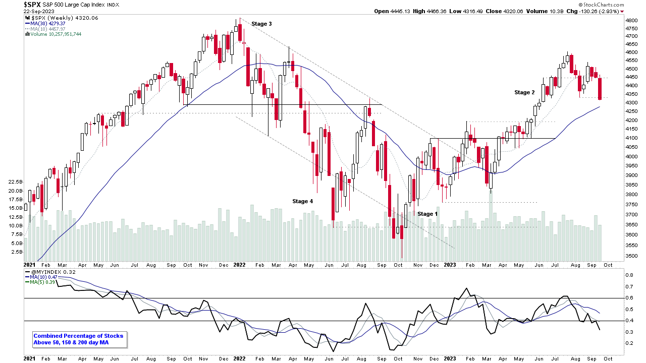
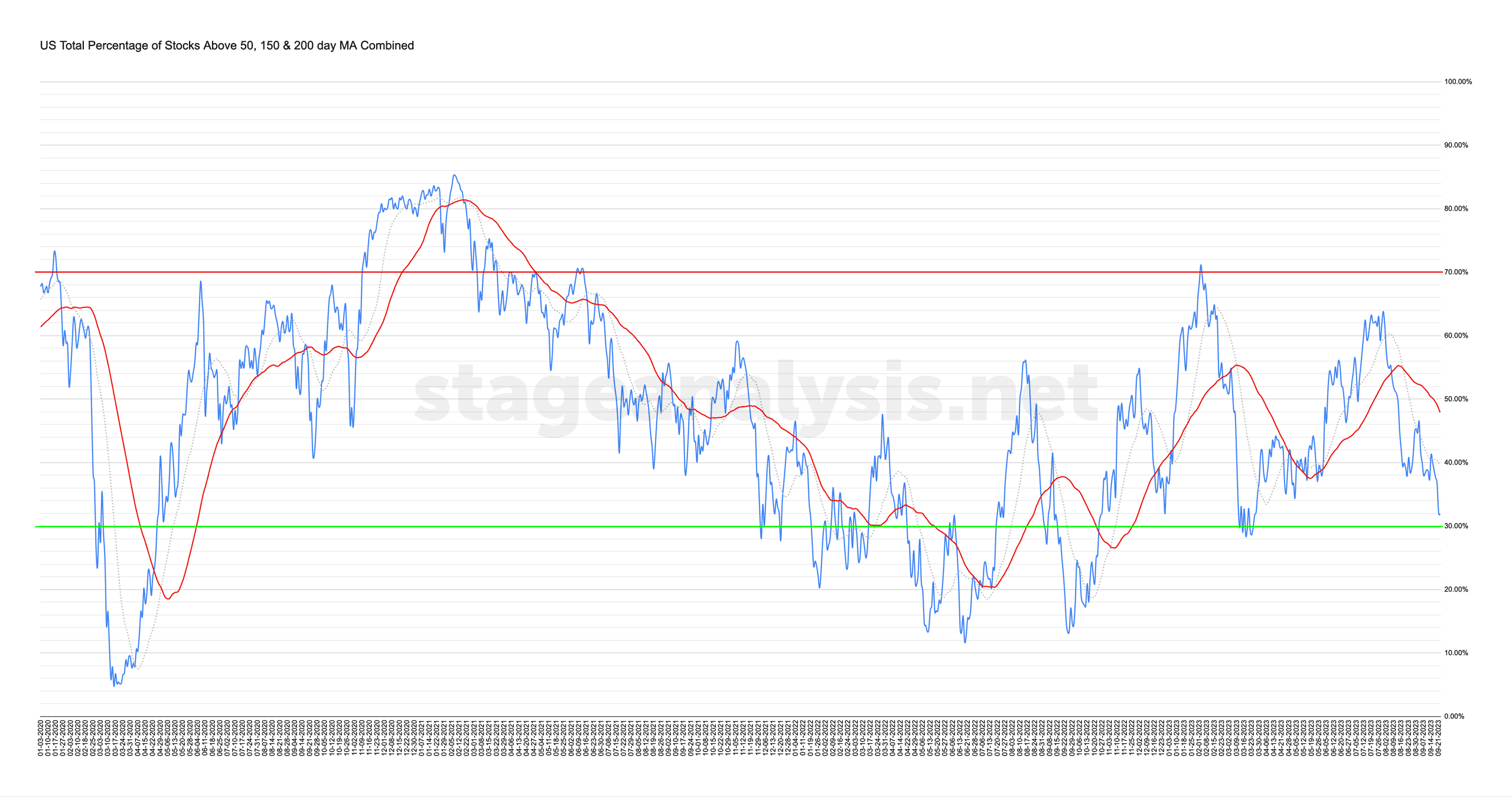
Market Breadth: Percentage of Stocks Above their 50 Day, 150 Day & 200 Day Moving Averages Combined
Custom Percentage of Stocks Above Their 50 Day, 150 Day & 200 Day Moving Averages Combined Market Breadth Charts for the Overall US Market, NYSE and Nasdaq for Market Timing and Strategy.
Read More
22 September, 2023
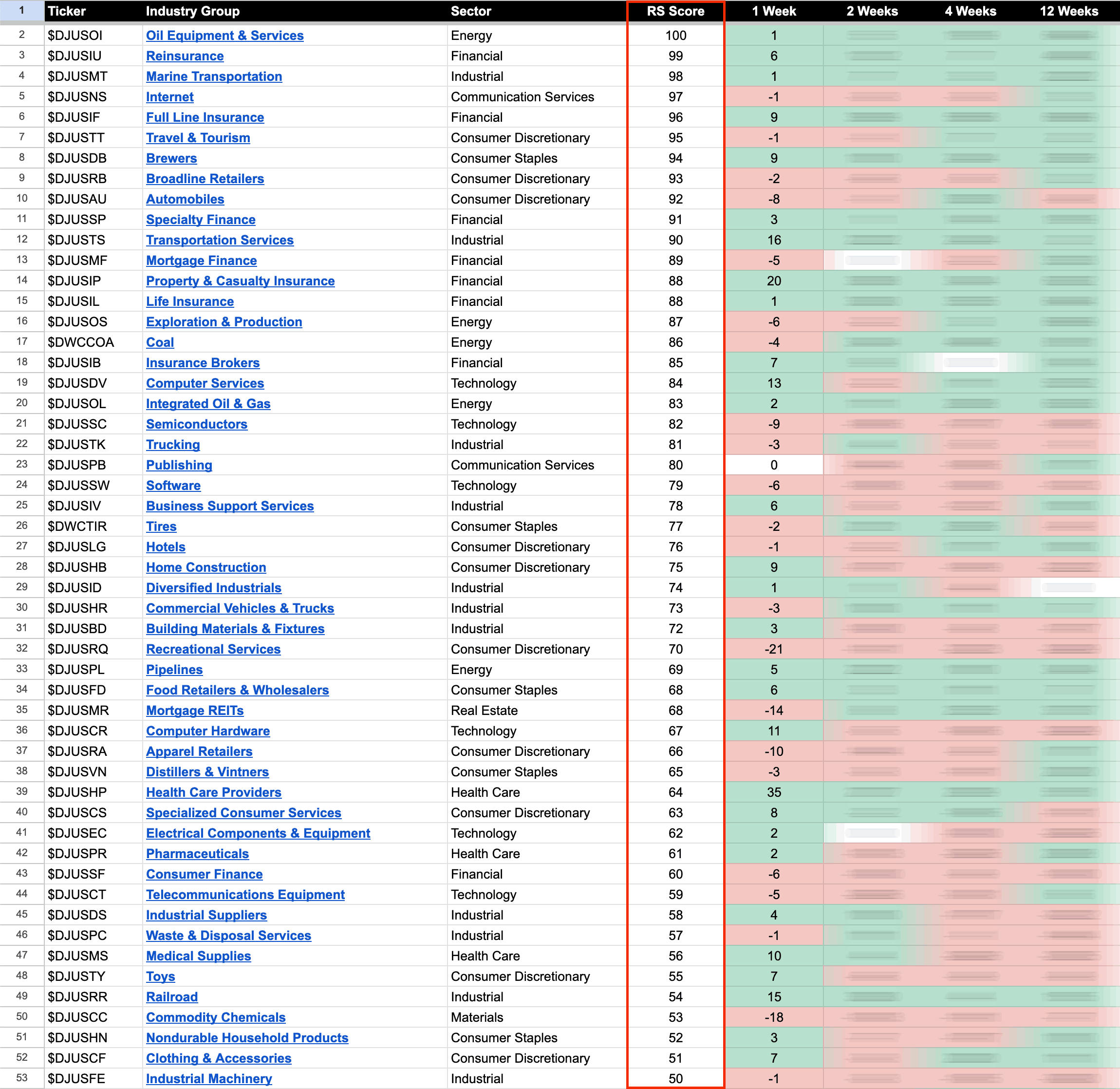
US Stocks Industry Groups Relative Strength Rankings
The purpose of the Relative Strength (RS) tables is to track the short, medium and long term RS changes of the individual groups to find the new leadership earlier than the crowd...
Read More
21 September, 2023
Stage Analysis Technical Attributes Scores – Nasdaq 100
The Stage Analysis Technical Attributes (SATA) score is our proprietary indicator that helps to identify the four stages from Stan Weinstein's Stage Analysis method, using a scoring system from 0 to 10 that rates ten of the key technical characteristics that we look for when analysing the weekly charts.
Read More
20 September, 2023
Stage Analysis Members Video – 20 September 2023 (21mins)
Stage Analysis midweek video discussing the major US stock market indexes and some of the short-term market breadth measures
Read More

